Reading the chart
What is a Relative Rotation Graph?
A Relative Rotation Graph plots how strong something is against a benchmark on one axis, and whether that strength is still growing on the other. Plot both over time and a symbol does not sit still — it travels, usually clockwise, through four quadrants.
The two axes, in plain words
Every point on an RRG is one symbol at one moment, measured against a benchmark — an index, a sector, or, on this site, gold. It takes two numbers.
RS-Ratio is the level. It asks: how does this symbol's price compare with the benchmark's, relative to its own recent history? Above 100 it is outperforming, below 100 it is lagging. It is smoothed on purpose — a single strong day should not move it far.
RS-Momentum is the rate of change of that level. It asks whether the outperformance is still growing. Above 100 the relative strength is rising, below 100 it is fading — whether or not the level itself is above 100.
The second number is the one that makes the chart worth drawing. A symbol can be strong and getting weaker, or weak and getting stronger, and those two states look identical on a performance table. On an RRG they are opposite corners.
The four quadrants
Leading — top right
Ratio above 100, momentum above 100. Outperforming, and the outperformance is still building. The comfortable quadrant, and the one a symbol leaves first through the bottom.
Weakening — bottom right
Still outperforming, but the momentum of that outperformance has turned down. Nothing has gone wrong in price yet; the lead is simply no longer widening.
Lagging — bottom left
Underperforming, and still getting worse. Symbols spend a long time here, and the ones worth watching are those whose momentum has quietly stopped falling.
Improving — top left
Still behind the benchmark, but the gap is closing. This is where a recovery shows up before it reaches the performance tables.
The usual path is Leading → Weakening → Lagging → Improving → Leading, turning clockwise. That is not a rule anyone imposed: it follows from momentum being the derivative of the level, so it peaks and troughs before the level does. Anticlockwise movement happens, and it is worth noticing precisely because it is unusual — it usually means a sharp reversal rather than a rotation.
Reading the trail, not the dot
One dot says almost nothing. The line behind it — the trail — says where the symbol has come from, how fast, and whether it is turning. Three things to read off it:
- Direction. A trail heading up and to the right is gaining on the benchmark and accelerating. Down and to the left is the opposite. The corner it is heading toward matters more than the quadrant it is in.
- Length. Long steps between nodes mean the relationship is moving quickly; a knot of short steps means nothing much is happening, whatever quadrant it sits in.
- Distance from the centre. The 100/100 crossing point is where a symbol behaves exactly like its benchmark. The further out, the more extreme the relationship — and the more likely it is to revert.
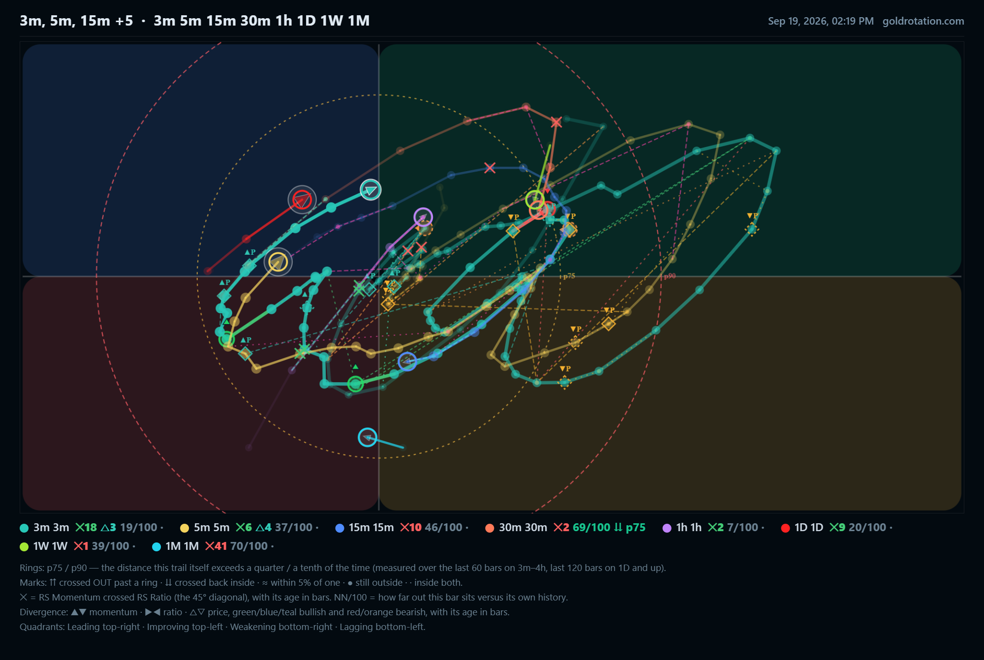
The timeframe changes the answer
An RRG is not one picture of one truth. The same symbol can sit in Leading on the hourly and Lagging on the weekly, and neither is wrong: they answer different questions. The hourly says what is happening this week; the weekly says what has been happening since spring.
That is why it is worth plotting several timeframes at once. A move that has turned on the hourly but not the daily is early. One that has turned on both is confirmed, and usually further along than it looks.
Everything depends on the benchmark
An RRG measures relative strength, which means the benchmark is half of every number on it. Change the benchmark and every dot moves.
Most RRGs use an index. That answers "is this stock beating the market?" — useful, but it hides the case where the whole market is losing ground to something else. Measuring against gold instead asks a blunter question: is this holding its purchasing power? A market up 8% in a currency that lost 12% against gold did not gain anything; against an index it looks like a winner, against gold it does not.
Neither benchmark is "correct". They answer different questions, and the useful habit is knowing which one you asked.
Four ways an RRG gets misread
Treating the quadrant as a signal
"In Leading, therefore buy" throws away the chart. A symbol deep in Leading and turning down has less ahead of it than one in Improving and accelerating. The direction of travel carries the information; the quadrant is only where it happens to be standing.
Comparing distances between different charts
The axes are scaled to the data on the chart. A point five units from the centre on one board and five units on another are not comparable unless both were drawn on the same scale. Compare a symbol with its own history, or with others on the same picture.
Reading a stale trail as a live one
A trail that stops updating still looks like a trail. If the last node is three days old, every conclusion drawn from its direction is three days old too — which is why a chart worth trusting says when its last bar closed.
Ignoring how far out it already is
Extremes revert, and "extreme" has to be measured rather than eyeballed. On this site each trail carries its own percentile bands — the distances it exceeds a quarter and a tenth of the time — so a reading of 90 out of 100 means further from the centre than nine tenths of its own past, rather than "looks far".
What to do with it
Used well, an RRG is a way of asking one question quickly across many symbols: what is gaining ground, and what is quietly losing it? It will not tell you what to buy, and any chart that claims to is selling something. What it does is stop a strong-looking name that peaked two months ago from looking the same as one that is turning up today.
The habits that make it useful are unglamorous: watch the trail rather than the dot, check more than one timeframe, know what the benchmark is, and treat extremes as extremes.
Next: Why
measure stocks in gold rather than against an index?
Then: Reading
RS-price divergence
Every chart on this page is live, free, and takes no sign-up to look at.
Open the rotation graph →