Reading the chart
Why measure stocks in gold?
A price quoted in currency is two facts added together and labelled as one: what the company did, and what the money did. Dividing by gold pulls them apart — and the arithmetic is simple enough that the only hard part is doing it with the right gold price.
The problem with a number in currency
Suppose a market index rises 8% over a year. That is the headline, and it is true. It is also incomplete in a way that matters: over the same year the currency it is quoted in may have bought 12% less gold at the end than at the start. The index went up. What an owner of it could buy went down.
None of this is visible in the chart, because the chart's y-axis is made of the same money that lost ground. A ruler that shrinks makes everything look longer.
This is not an argument about whether gold is good. It is an argument about units. Any figure you compare across time or across countries needs a unit that means the same thing at both ends of the comparison, and a national currency does not.
What "priced in gold" actually means
The calculation is one division. Take the price and divide it by the price of one ounce of gold, both on the same day and in the same currency. What comes out is not money: it is how many ounces of gold the share is worth — its purchasing power.
purchasing power = price in local currency ÷ gold price in that same currency
The units cancel. Baht divided by baht-per-ounce leaves ounces, and an ounce in Bangkok is the same weight as an ounce in New York — which is the entire point.
Track that number instead of the price and the two facts separate. A rising line means the company gained ground against a constant; a falling line means it lost ground, whatever the currency chart says.
The part most charts get wrong
Here is where it usually goes off the rails. Gold is quoted in dollars — XAUUSD — and a Thai stock is quoted in baht. Dividing baht by dollars-per-ounce produces a number with no meaning at all: the currency has not cancelled, it has been mixed in twice.
The gold price has to be converted into the market's own currency first:
gold in local currency = gold in USD × (USD → local exchange rate)
purchasing power = local price ÷ gold in local currency
A Thai stock is divided by gold in baht, a German one by gold in euro, a Japanese one by gold in yen. Each market gets its own denominator, and only then can the results be compared with each other.
Skip that step and you have not measured purchasing power — you have measured purchasing power plus a currency bet, and you cannot tell afterwards how much of the answer was which. Every gold-adjusted figure on this site does the conversion per market, which is why a Thai stock and a German one can sit on the same heatmap and mean the same thing.
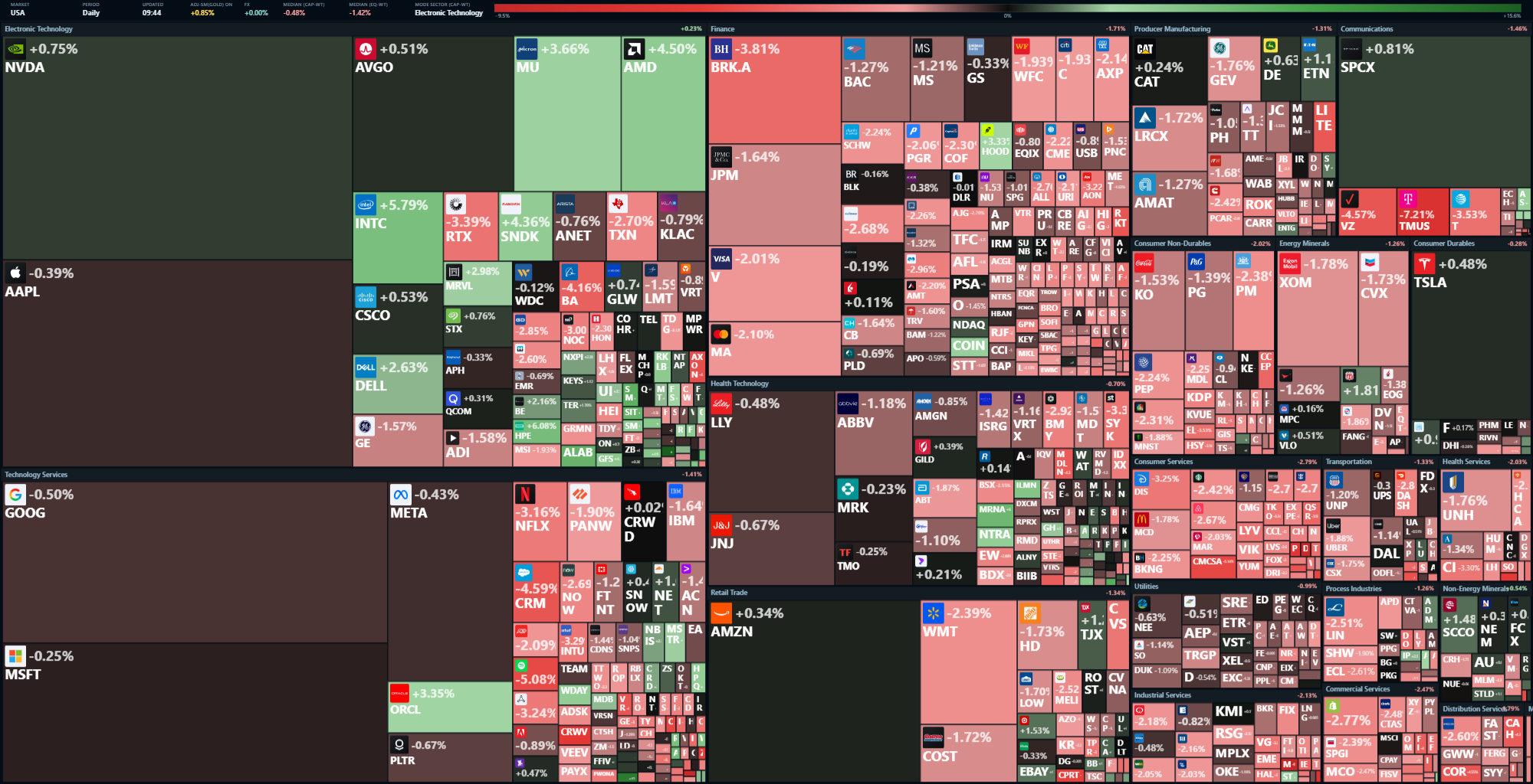
What changes when you switch the ruler
Four things happen, and none of them is subtle once you have seen it.
Currency rallies stop counting as performance
A market that rose mostly because its currency fell — exporters repricing, foreign earnings translating back at a better rate — stops looking like a discovery. The gain is still real to a local holder paying local bills; it is not a gain in what the shares can buy.
Different countries become comparable
Comparing a Japanese index with a Brazilian one in their own currencies compares two different questions. In ounces they answer the same one, and the ranking often changes.
Long periods look different from short ones
Over a week, the currency and the gold price barely move and the two measures agree. Over years they can diverge enormously, which is exactly when the difference matters — and exactly when a chart in currency is most comforting and least informative.
Sideways becomes visible
A price grinding up in currency while grinding down in gold is one of the most common shapes there is, and it has no name in the currency chart. In ounces it is unmistakable: a market marking time while the unit of account slips underneath it.
The fair objections
Measuring in gold is a choice of unit, not a religion, and the arguments against it deserve straight answers.
| Objection | The honest answer |
|---|---|
| Gold moves too. It is not a fixed ruler. | True. Nothing is. Gold's advantage is not stability but indifference: no government sets its supply, and it has no earnings to miss. It is a noisy ruler that nobody controls, against a smooth one that somebody does. |
| You cannot spend ounces. | Also true, and the reason currency charts should not be thrown away. Bills arrive in currency. Gold answers a different question — whether wealth was preserved — and the two are worth reading side by side rather than choosing between. |
| Gold pays nothing. | It does not, which is a cost of holding it and irrelevant to using it as a unit. A measuring stick is not an investment. If the comparison should include dividends, use a total-return series in the numerator — the denominator does not change. |
| Everything looks bad in gold. | Not everything, and not always — there are long stretches where most things beat it, and that is information too. If a period makes almost every asset look weak against one metal, the finding is about the money, not about the assets. |
Gold as a benchmark on a rotation graph
A Relative Rotation Graph measures strength against a benchmark, so the benchmark decides what the whole chart means. Against an index, it answers "is this beating the market?". Against gold, it answers "is this holding its purchasing power?" — and the second question keeps working when the market itself is the thing losing ground.
That is the version this site draws: hundreds of symbols rotating around gold rather than around an index, with each market's own local gold price as the denominator.
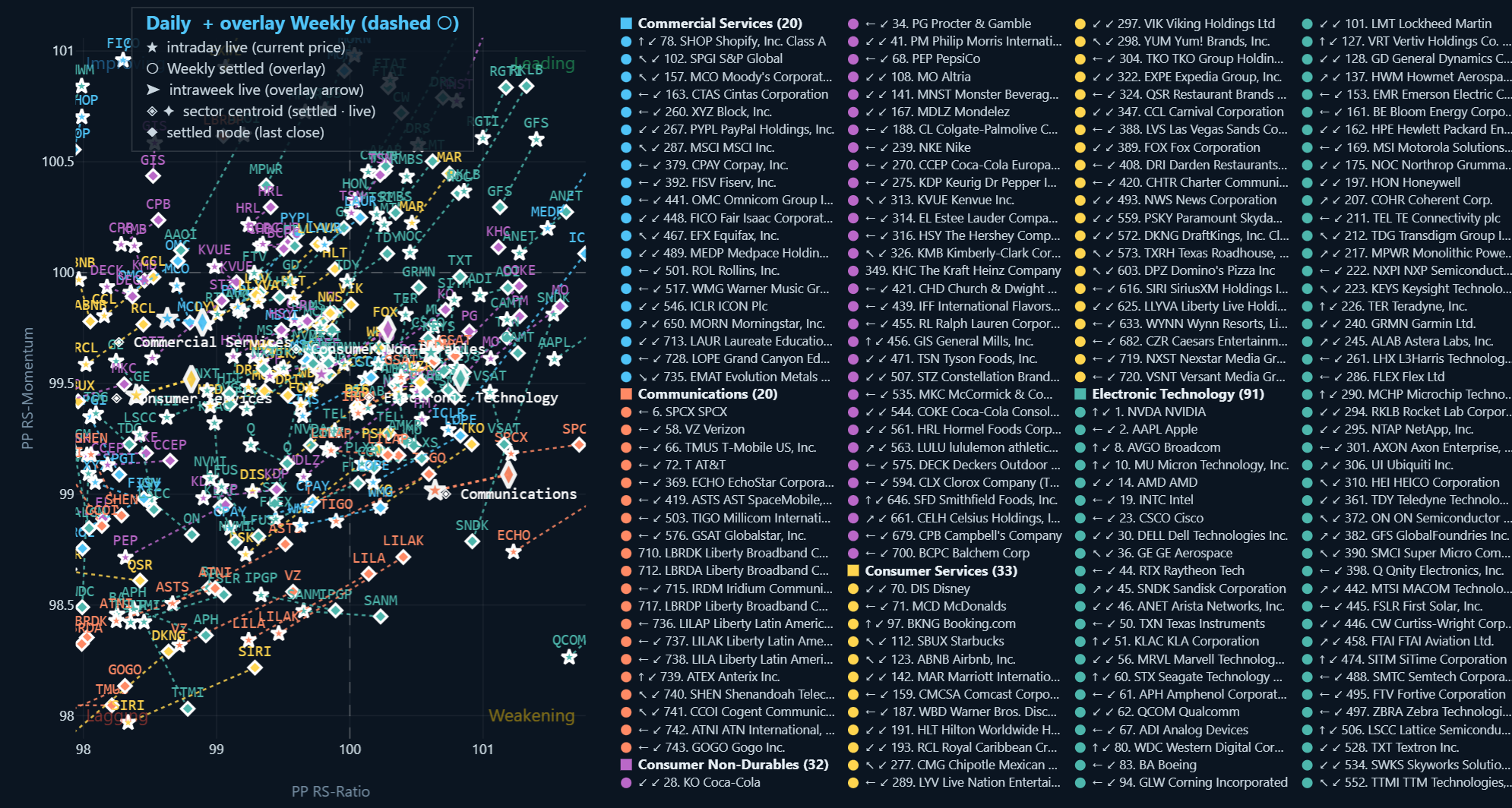
The practical habit is not "always use gold". It is knowing which ruler produced the number in front of you — and being able to switch, because the difference between the two is itself a measurement.
How to read it without fooling yourself
- Check both. A stock up in currency and up in gold is genuinely strong. Up in one and down in the other is the case worth thinking about, and it is common.
- Match the horizon. Over days the two measures barely differ; over years they can tell opposite stories. Use the one that matches the decision you are making.
- Watch the denominator. A move in gold itself shifts every gold-adjusted line at once. If everything turns on the same day, suspect the ruler before the assets.
- Keep the raw number. Purchasing power is an additional measurement, not a replacement — every gold-adjusted figure here has a no-gold counterpart for that reason.
Every market on this site is measured both ways, free and without sign-up.
Open the charts →
Next: What is a Relative Rotation Graph, and how do
you read one?
Then: Reading RS-price divergence