Reading the chart
Reading RS-price divergence
A divergence is a disagreement: price makes a new high, and the thing that is supposed to be driving it does not. It is one of the few chart patterns with an argument behind it rather than a shape — and one of the easiest to over-read.
The idea, before the rules
Any price move is made of participation: how much buying it took to get there. Most of the time a higher high comes with more of it. Occasionally it does not — the price gets there anyway, on less. That gap between what the price did and what the measure behind it did is a divergence.
It is not a prediction. It is a description of how the last move was financed, and the honest way to hold it is as a question: if this high needed less strength than the last one, what happens when the next test comes?
Why relative strength, and not just momentum
The familiar version of this pattern uses an oscillator built from the symbol's own price — RSI, MACD. That answers an internal question: is this move slowing relative to its own history?
Relative strength asks something different and, for an owner of anything, more useful: is this move keeping up with a benchmark? A stock can make a new high in its own currency while falling behind the index — or, on this site, while losing ground against gold. That is a divergence a price-only oscillator cannot see, because both of its inputs come from the same place.
RSI divergence says the move is tiring. RS divergence says the move is being outrun. Two different findings, and the second one survives a rising market.
Regular and hidden
The pattern comes in two forms, and confusing them is the commonest mistake in the whole subject. They are read from the pivots — the swing highs and lows — of price and of the measure beside it.
Regular bearish
Price makes a higher high; relative strength makes a lower
high. The new peak was reached with less relative support than the last one.
price HH + RS LH
Regular bullish
Price makes a lower low; relative strength makes a higher
low. The new low was reached with less relative selling.
price LL + RS HL
Hidden bullish
Price makes a higher low while relative strength makes a lower
low. A pullback that shook the measure but not the price — usually read as the
trend continuing. price HL + RS LL
Hidden bearish
Price makes a lower high while relative strength makes a higher
high. The mirror image, in a downtrend. price LH + RS HH
Regular divergence argues for a turn. Hidden divergence argues for continuation. Same machinery, opposite conclusions, and the only thing separating them is which series made the new extreme.
Three axes worth checking
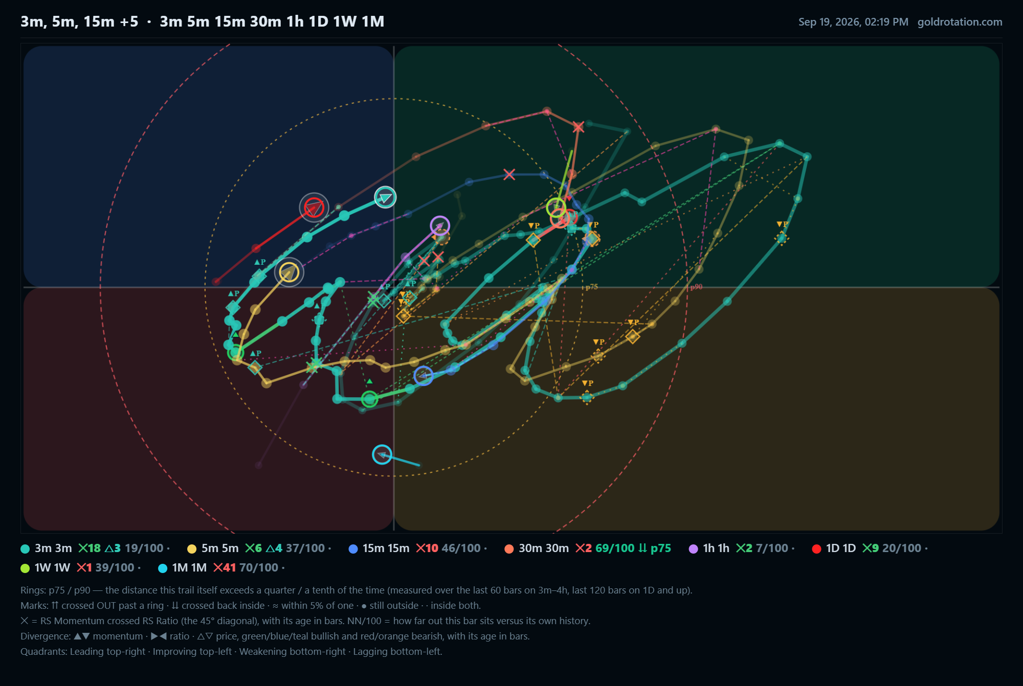
On a rotation graph there is more than one measure to disagree with price, and they do not always disagree together. This site checks all three on every timeframe and marks each where it happened:
| Axis | What it compares | What it tends to mean |
|---|---|---|
| Momentum ▲ ▼ |
Price pivots against RS-Momentum — the rate of change of relative strength. | The earliest of the three, and the noisiest. Momentum turns before the level does, which is the point and also the catch. |
| Ratio ▶ ◀ |
Price pivots against RS-Ratio — the level of relative strength itself. | Slower and heavier. When the level disagrees with price, the relationship has already changed rather than merely begun to. |
| Price pivots △ ▽ |
Confirmed swing highs and lows in price, against relative momentum at those same pivots. | The strictest: a pivot only counts once a later candle has closed beyond it, so nothing is marked on a high that is still forming. |
Agreement between axes is worth more than any one of them. A momentum divergence alone is a hint; the same disagreement showing in the ratio is a statement.
What disqualifies a divergence
Most of the value in an automated check is not in what it marks — it is in what it refuses to mark. Three rules do most of that work.
Both fell: that is a downtrend, not a divergence
A lower high in relative strength beside a clearly lower high in price is not a disagreement at all; the two agree, and the move is simply down. A bearish divergence needs price to have made the new high that strength declined to confirm.
The pivot has to be finished
A high is only a high once price has come back from it. Marking a divergence on the highest bar so far means re-drawing it every time a new bar prints — which is how a chart ends up full of signals that were never there at the time. A pivot counts here only after a later candle closes past it.
The swing between the two pivots has to be real
Two peaks with nothing between them are one peak with a wobble. The check asks where the trail went in between: a swing that left the quadrant entirely is a genuine cycle and is marked strong; one that only wandered into neighbouring ground is marked mild. Both are shown, labelled differently, because a mild one is worth knowing and not worth acting on alone.
Four ways to over-read it
- Treating it as a trigger. A divergence says the last move was thinner than the one before. It does not say when, or whether, that matters. Price can make three more diverging highs before anything happens — and frequently does.
- Ignoring the trend it sits in. Regular bearish divergences appear constantly in strong uptrends and most resolve by the trend simply continuing. In a topping market the same mark means considerably more.
- Reading one timeframe. A divergence on the 15-minute chart and one on the weekly are not the same finding in different sizes; they are different findings. The weekly one is about the position, the 15-minute one is about the afternoon.
- Forgetting the benchmark. RS divergence is measured against something. Change the benchmark and the divergence can disappear or appear. That is not a flaw — it is the measurement telling you which comparison you asked for.
Using it without being used by it
The workmanlike use is as a filter, not a signal. It rarely tells you to do something; it often tells you that something you were about to do deserves a second look — a breakout with the strength behind it fading, a low that looks awful and is being sold less hard than the last one.
What makes it practical is not having to hunt for it. Every timeframe on this site is checked on all three axes as the data updates, each divergence is marked where it happened with its age in bars, and email or browser alerts can carry the new ones to you — so the question becomes what to make of it, rather than whether you noticed.
Divergence detection runs on every timeframe, free and without sign-up.
Open the charts →Also worth reading: What is a Relative Rotation Graph? · Why measure stocks in gold? · The maturity wall